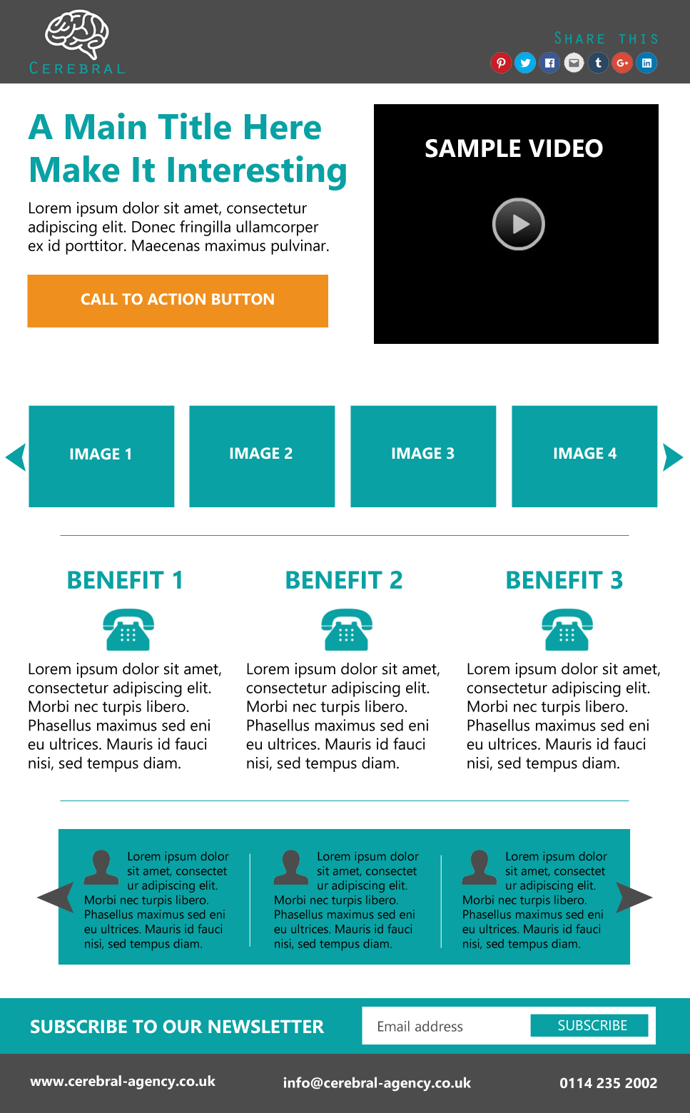
If you’ve got a campaign running on social media, email or anywhere that you need to point people to a landing page, you want to convert as many visitors as possible into potential new customers. Here’s what your landing page should look like to achieve maximum results. Scroll to the bottom of this article to see an example layout.
1. No Navigation
There should be no navigation. Having navigation will allow your visitors to move away from the page and, as a campaign landing page isn’t usually within site navigation, they will have no way to get back to it. Remove your site navigation from the page in order to focus visitor attention on your primary aim, which is your CTA (Call to Action) button.
2.Social Sharing Icons
You should add social sharing icons to your landing page. N.B. These are not links to your social media channels; these are buttons that, when pressed, allow the user to share the page directly to their social media accounts. If you are adding social share buttons then ensure your meta data is set with what image and text you want to appear in the share, e.g. for Facebook, Opengraph data should be used to control what the user shares to Facebook.
3. Headline & Text
Your headline needs to grab the user’s attention immediately and hold it. A short amount of supporting text should be included underneath, which should further explain the proposition, succinctly and with emphasis on the sell. This is the point that visitors will either stay and read on (and hopefully press the CTA button) or leave because they feel the proposition isn’t relevant to them.
4. Video
Research shows that visitors to websites and social media engage more with video than the written word. Maybe it’s to do with effort. Maybe it’s to do with the enthusiasm for the product that can be relayed in a video compared to in text. Either way, video will engage your visitor and feed them further information about your proposition. BUT, don’t make your videos too long, or you’ll lose the viewer’s interest before you’ve got your point across. An engaging teaser or explainer video should be enough to convince your visitor to continue down the path to CTA.
5. CTA Button
A highly visible Call To Action button lets your visitors know exactly where to click to take further action on your proposition. It needs to be big and bold and stand out above anything else on the page so that, at the point at which they decide to take the next step, visitors know quickly and instinctively where to go on the page.
6. Images
Adding images to your landing page gives visitors a more in-depth look into your product or service. It’s a quick, visual trigger that allows you to convey your offering without relying on the visitor to commit to watching a video. You could make your images tell a story, showing the benefits of and reasons why someone should use your product or service. For example, let’s take a plumbing company whose landing page aim is to get customers for new boiler installations. The first shot could be of an old, rusty, broken down boiler, the second could be of them taking the old boiler away, the third could be the company cleaning and prepping the area ready for the new boiler and the final shot could be of a happy family looking at their new boiler in place and keeping them nice and warm.
7. Benefits
This is where lots of companies fall down and mostly it’s because they are too involved in their own product or service to be able to take a step back and talk about it in terms of how it would benefit the client rather than what it does. Remember, you need to sell the sizzle, not the sausage. The benefits relevant to your campaign should be easy to read in bite sized chunks. Use bullet points and visual icons to illustrate your unique selling points.
8. Testimonials
No-one wants to think that they’re the first person to try you out. They’re wary of becoming the customer of a new company and want to know that other people have been successful in dealing with you in the past. What better way to do that than with testimonials? Testimonials provide authority on your product or service and add an outside, human element to an otherwise sales focused landing page.
9. Subscribe
There’s no easier or more cost-effective way of talking to customers or potential customers than emailing them with your latest news, offers, products or services. Once you’ve got someone onto your landing page, why lose them? If they showed interest but aren’t ready to buy yet or follow your CTA, then give them the option to subscribe to your newsletter. N.B. If you offer a subscription button, then make sure you regularly send out a targeted and relevant newsletter.
10. Contact
It’s still possible that after all the different forms of information and calls to action, people will still have questions, or, they simply may just want to talk to a human being before making the commitment. Give your visitors a range of ways of getting in touch with you. Make it as easy as possible for them to connect with you.
Example Layout For The Perfect Landing Page
